
Conan Process
What is best in life? Art Tutorials.

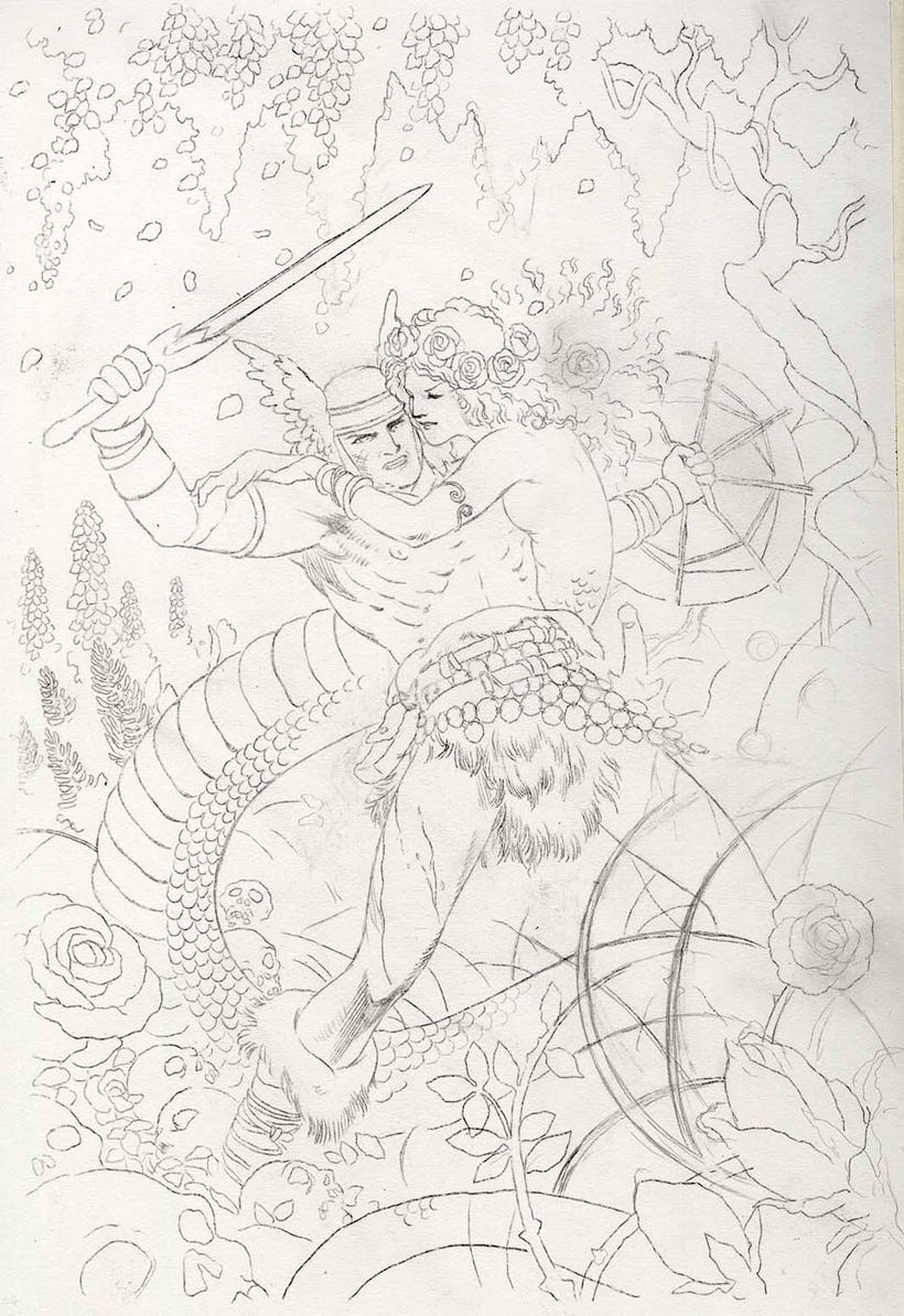
Not hard to figure out what I'm doing here, as you can see. Thumbnails. Very rough thumbnails.
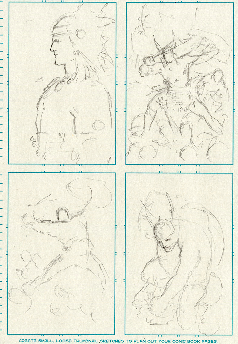
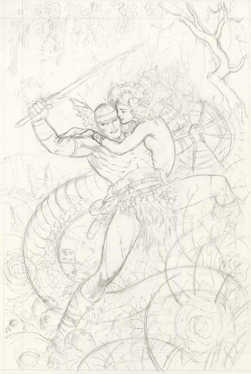
Above, the thumbnails, really rough. Below, the prelim sketch.
I love being able to scan my work into the computer. Looking at the work on the drawing board, then looking at it on my computer always makes it easier for me to see mistakes. Almost every analog artist I know uses a computer to do this.
I can see my original main figure is a bit squat, so I extend and stretch it to make him taller and lankier.
I'm using the art of Barry Windsor-Smith as my model for the look of this piece.
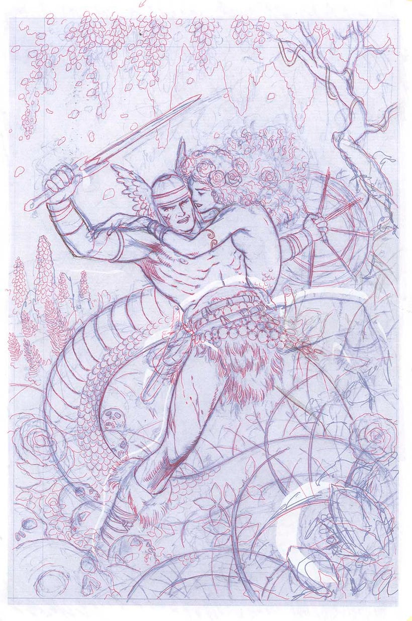
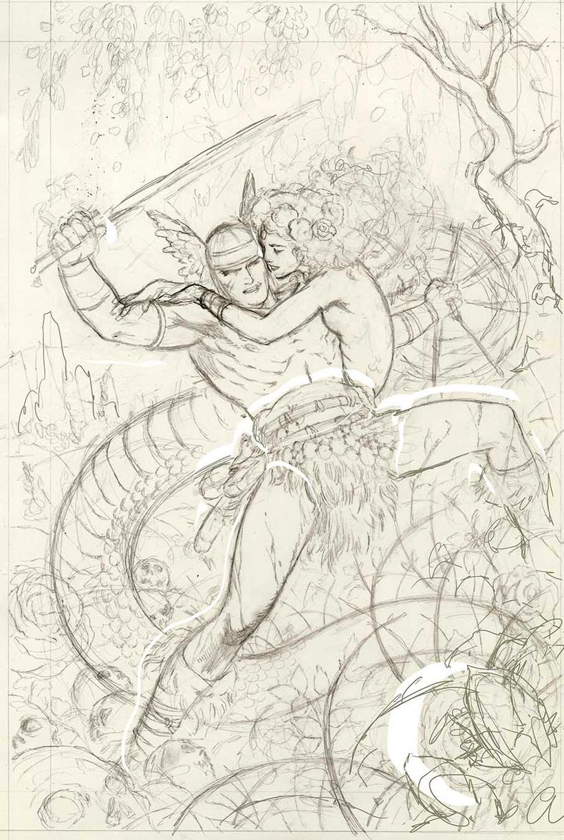
I print the grey drawing out in blue to transfer the art to my illustration board. I smear graphite all over the back of the paper, carefully tape it to the illustration board, and then trace the lines with red pen. As I go, I find changes I want to make. The raised leg looks awkward, so I take it out.
The drawing transferred to the paper, I always hate how dead the line looks at this stage. It will take another two hours and more to tighten this up. I also realized I changed the Lamia's face in a way I don't like. I'll change it back.
Let the inks begin.
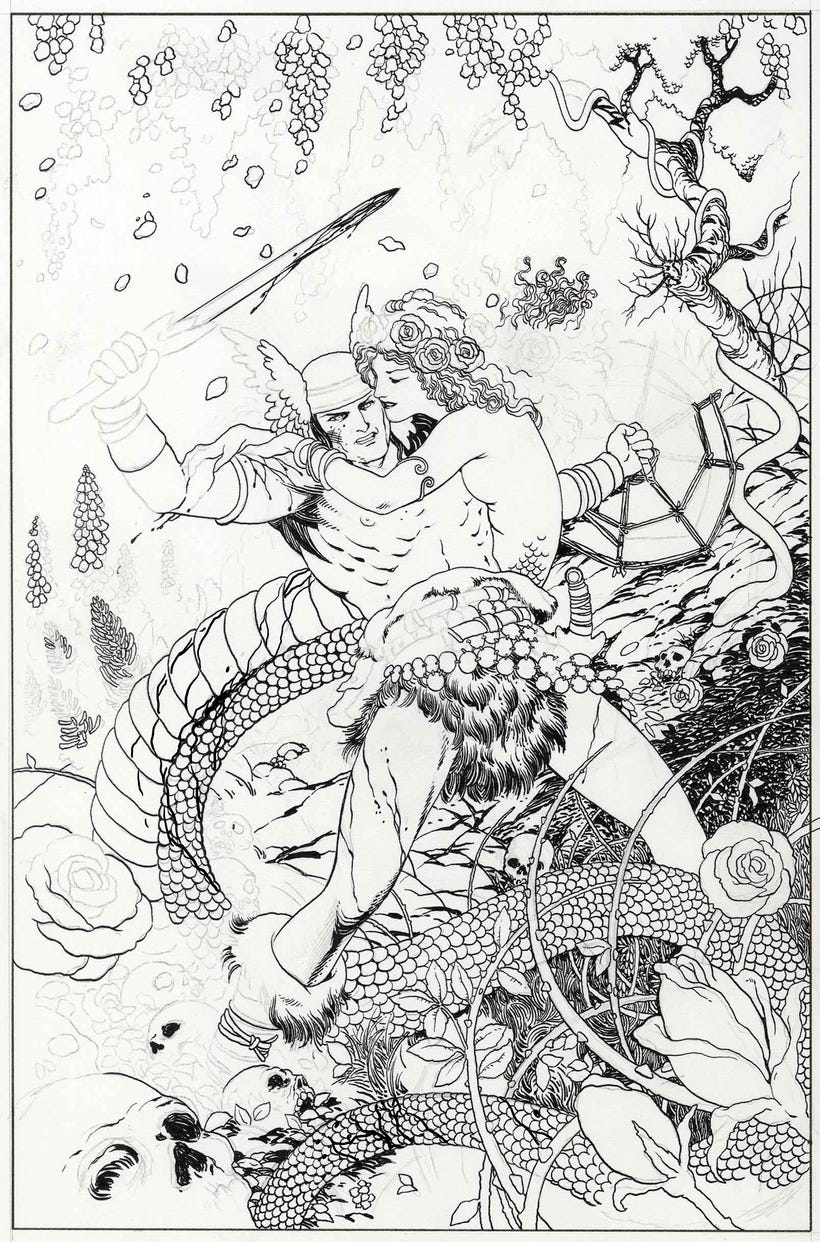
This is pencil on Strathmore Mixed Media board with Dr. Martin's Black Star ink. I love this ink more than I can say. I am also using 100 year old crowquill pens for this.
The Black Star ink is fairly thick and dries quickly, so it gums up the pens fast. However, I have a thirty year old sonic pen cleaner that gets the gunk out right now! Pens are like new in no time. A lot of people toss pen points because they can't clean them properly, but get a sonic cleaner and your job is done. Saves a ton of money, these crowquill points are expensive these days.
If you don’t have one of those sonic cleaners for pens, honestly, the ones they use for jewelry will do just fine. LINK HERE.
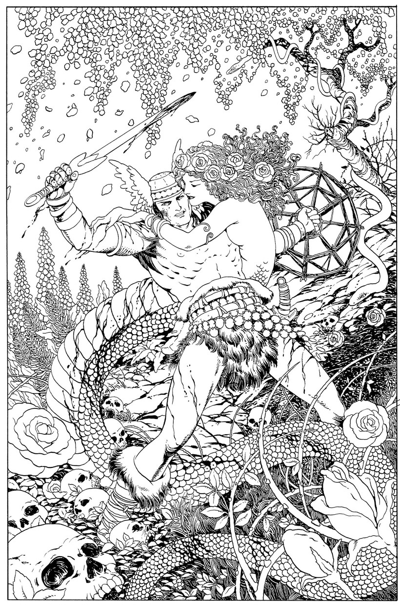
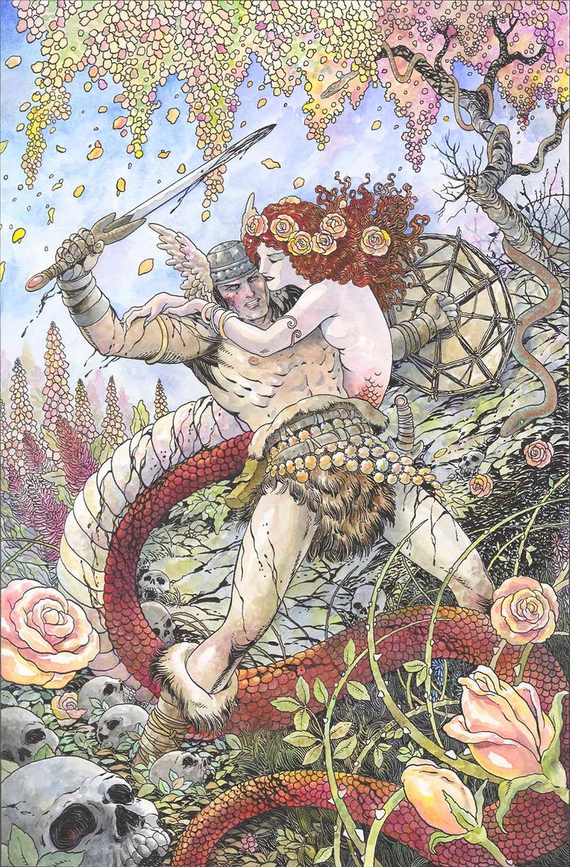
I haven't painted in ink over watercolor much, and since I was not sure I'd be able to pull this off, I decided to make sure there was a solid scan of the black and white art in case I botched it and had to color the final digitally. Fortunately, I got through the entire piece without a single error! Watercolor is hard to correct, but painting in watercolor over ink corrections is really hard!
Not only was this really fun to do, it went very smoothly! I was surprised how well the watercolor worked with this ink. I used many ink markers on Chivalry - ink, of course, but not as dense as dip pen ink. They are not as pure in color.
The Black Star ink is solid as a rock. Even with some heavy scrubbing about with the watercolor in places, I lost almost no ink density. The deep black remains black. Very little residue from the watercolor.
Moreover, the ink resists the watercolor, so it is very easy to control the bleed of the watercolor and get the paint clean and inside the lines. I'm very happy with the effects I am getting here.
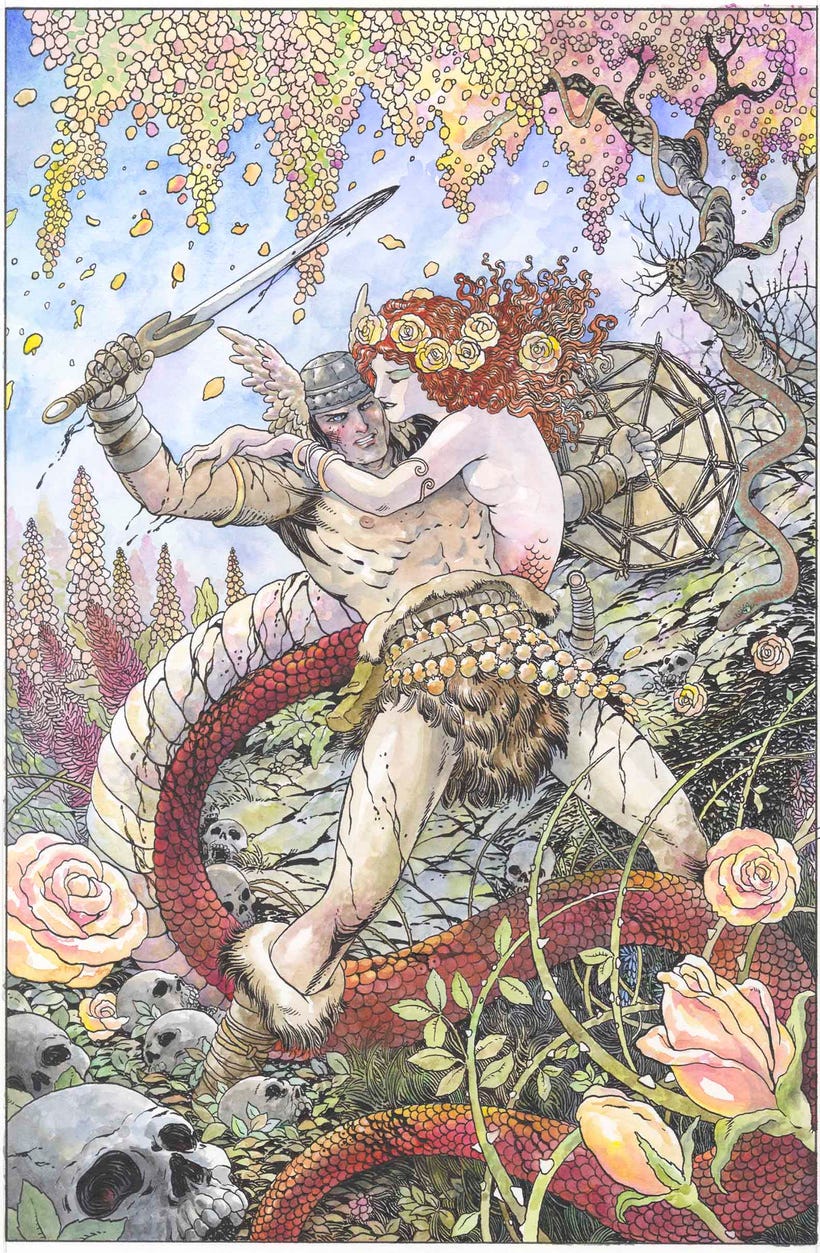
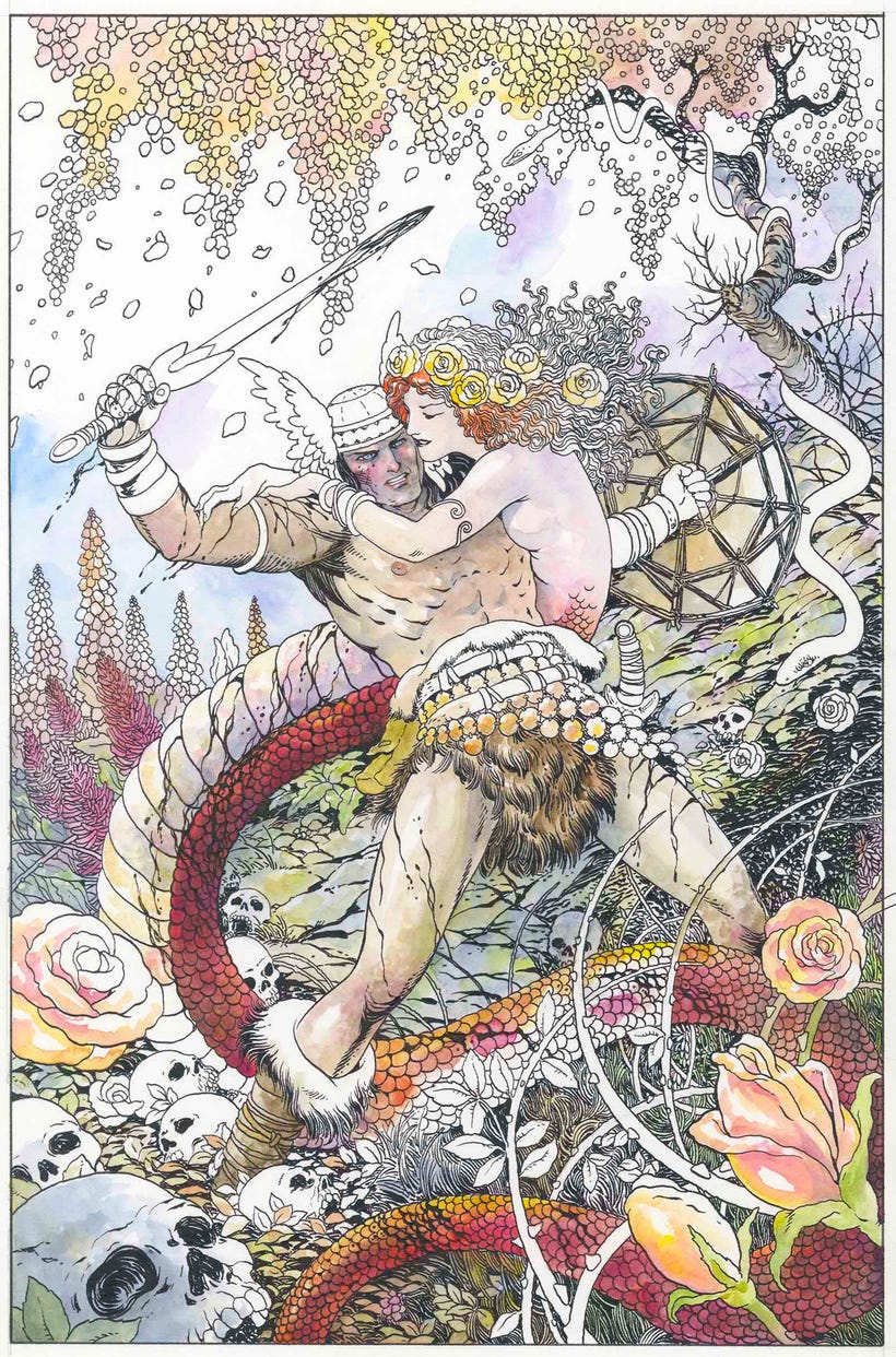
Almost finished. I've used iridescent paints on the snakes. The effect is invisible on the scan, but whoever gets the original art will love it. I'm using Barry Windsor-Smith as my art model here, and I really love following his lead on using gobs of paint for color instead of going with smoother gradations as I usually try to do. This is a fun way to paint and I love the effect. He uses more violet than I do, and does interesting things with dots and dashes of color I didn't try much here. I also think he used a lot of gouache, and I used none, except for a few small dabs of white highlight.
I add a few more shadows and highlights and deepen the color in the paints, especially in the red hair, and then tweak slightly in Photoshop to take out the greyish tint in the paper.
Funny note: the publisher asked me to downplay the handle of the knife at Conan's hip because they thought it looked too phallic. I about died laughing.
I not only had nothing but fun with this piece, but I think I'll be doing more of my commissions and assignments this way.
When Barry Windsor-Smith did many of his ink over watercolor pieces, some were drawn in ink, then reproduced onto acetate, then colored on a bottom layer in Dr. Martin's concentrated watercolor, which is how he got those screaming deep purples and magentas. Unfortunately, it's also how a lot of his art ended up fading and getting weird color shifts.
Obviously I'm not doing that.
Also, I asked some of my peeps how they correct ink mistakes when they paint over watercolor, and they say they just use gouache. I hate doing that because you can usually see the difference in the paint, but you gotta do what you gotta do. Usually, I just try to avoid making any mistakes at all.
I timed it, and I went over 27 hours without making a mistake on this one.
This was originally published in 2023 on my Patreon which is entirely reader supported. Sign up to support my art here, or run on over to my Patreon with more content, more frequent updates, and many extras.
You’ve said in the past that you’re not a fan of colored inks and dyes. Inexplicably, I am more comfortable working with them than I am with watercolors. Please refresh my flagging memory. What do you see as the issues with that medium?
Oy. All those details, yo! 1000 times wow.