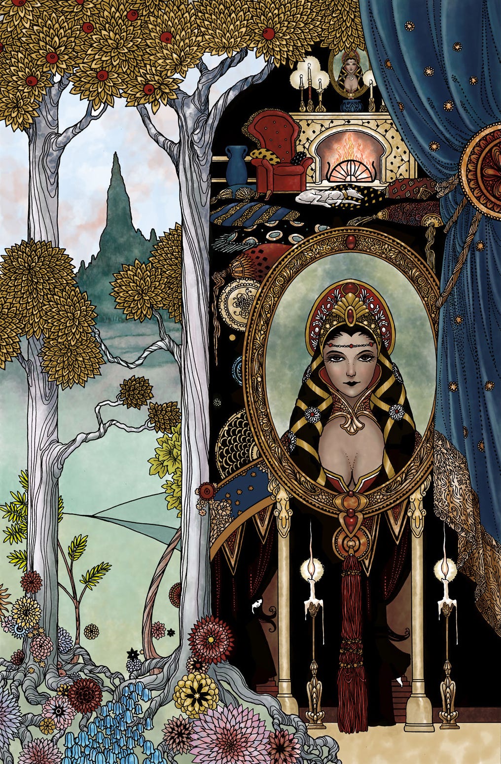
I used to get a lot of ribbing for having an elaborate, decorative style. The word was, artists who choose to add decoration and complex rendering are probably hiding drawing deficiencies.
While I agree that this is sometimes the case (and I can think of a few artists who make my hair go the wrong way with endless rendering and very weak underdrawing,) not all of us are covering up poor structure with frou frou.
I always start with a simple, solid drawing before adding the stylization. If the drawing isn’t solid, I don’t proceed until it is.
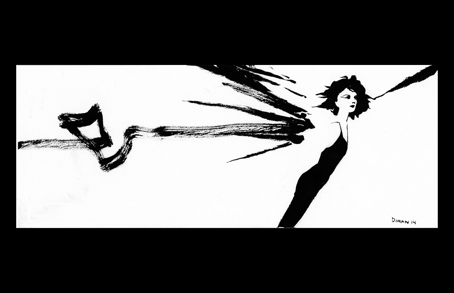
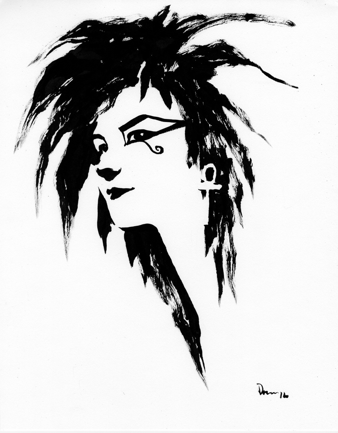
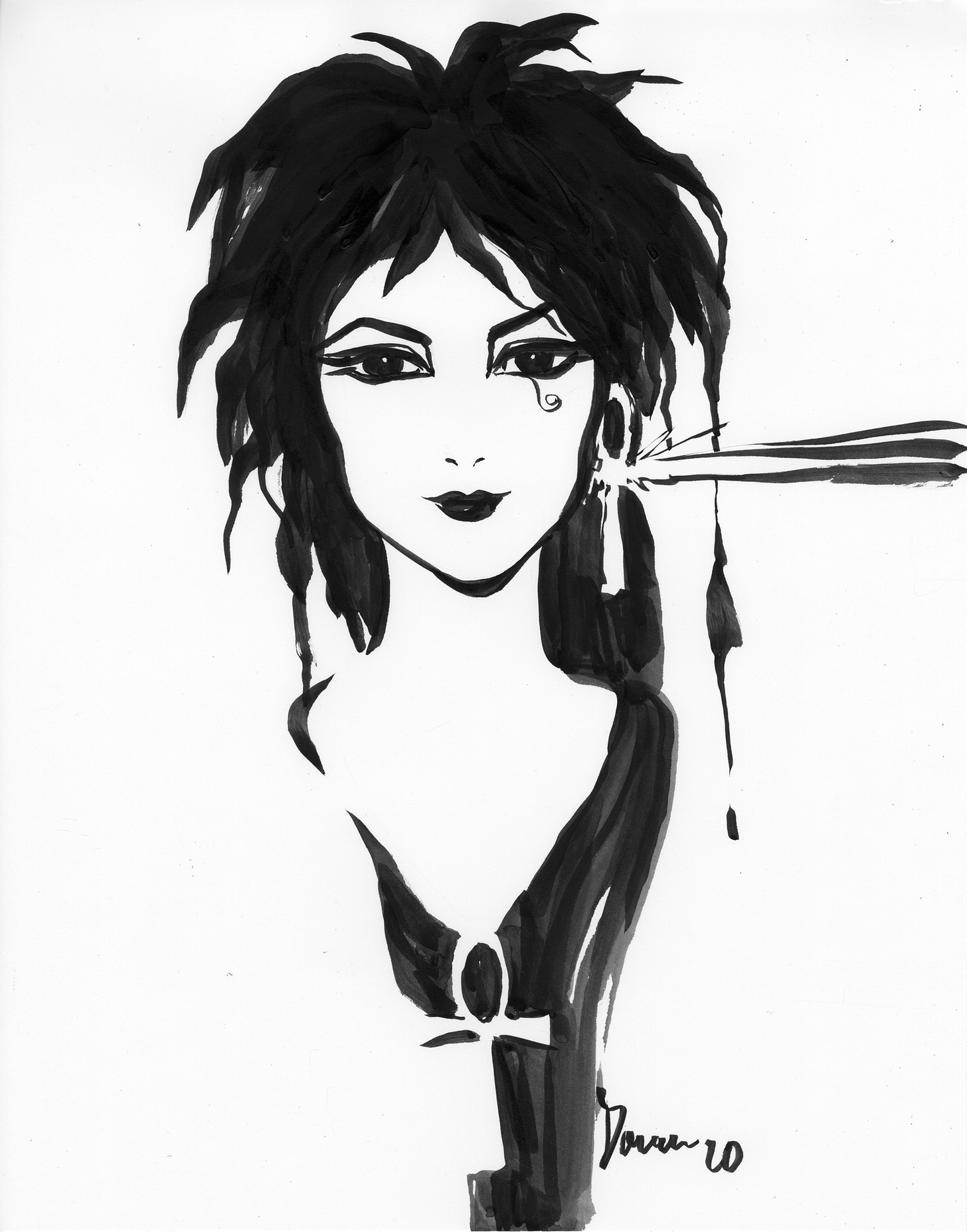
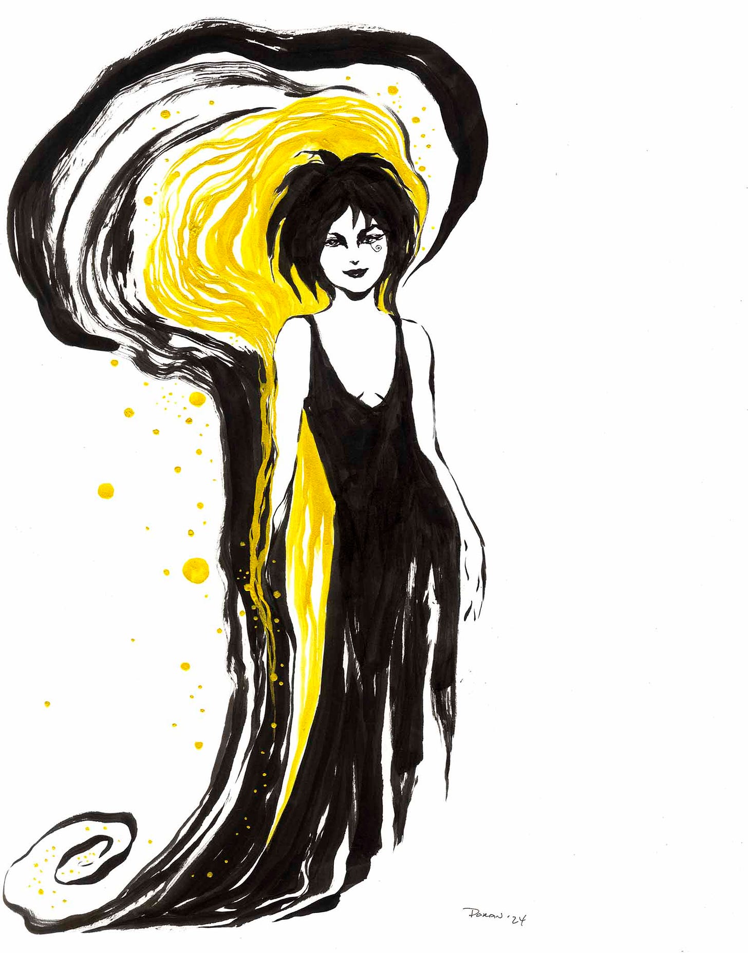
Awhile ago I decided to challenge my skill set with a series of minimalist brush and ink pieces. I limited the time cost of each drawing to 10 minutes or less. And I tried to stick to no underdrawing, if possible.
That is, one and done, no prelim. Ink only, nothing else.
While I’ve shown some of these drawings before, you folks on Substack probably haven’t seen most of them.
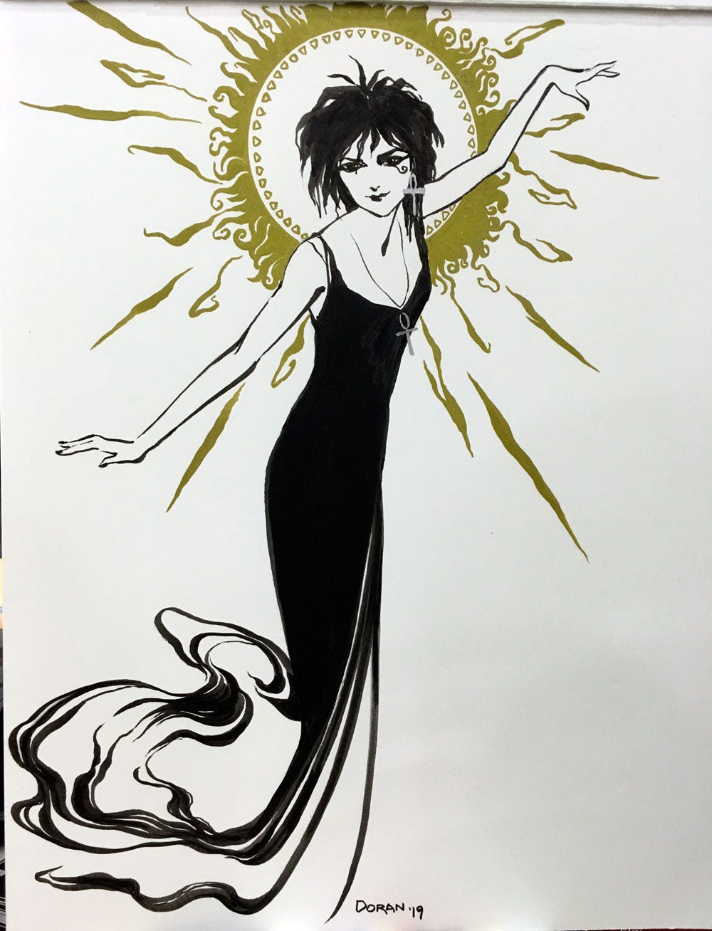
Most of the original exploratory sketches were based on characters from Neil Gaiman’s SANDMAN series, like this group of sketches of Death.
And some are a bit more elaborate with the addition of 24K gold ink or other metallic inks.
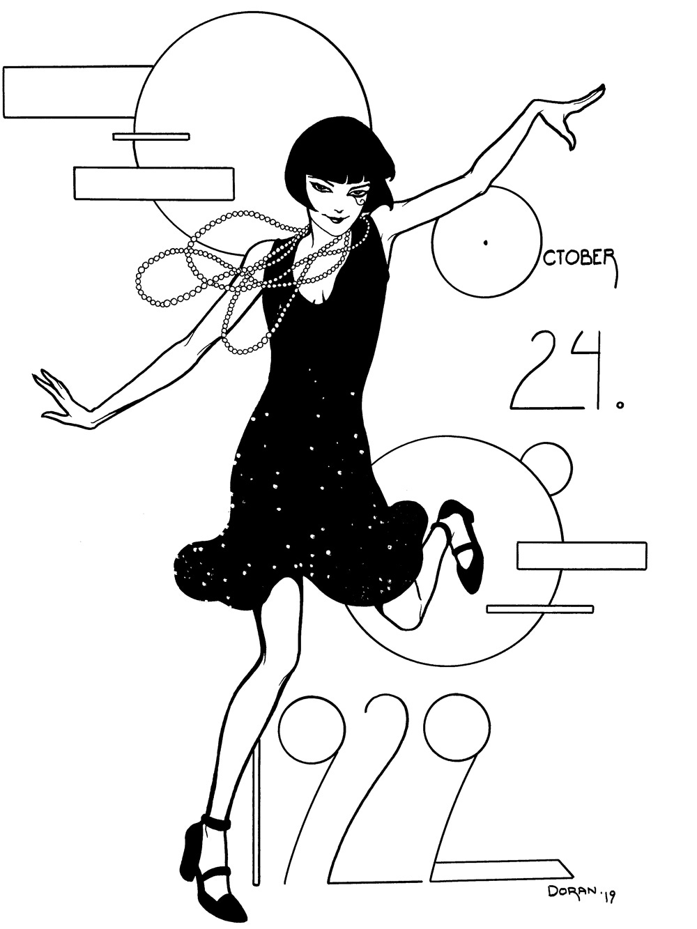
And, of course, sometimes I like to go right back to pen and ink and do something with a bit more line control, like this Death as a flapper doing the Stock Market Stonk.
The fate of my retirment account in one picture.




Colleen, if a publisher wants to work with you, how far in advance would they need to reach out to you on a prospective project? It seems like you're booked on projects maybe 2 years out?
Absolutely beautiful drawings. They are not only exceptionally well-done, they also capture the essence of Death. Thank you for sharing.
Can you buy these as prints?