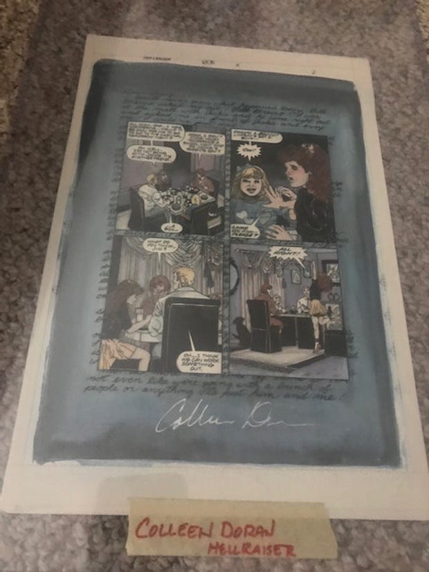
A fan wrote to me to ask if this was a page of my original art, or just a copy.
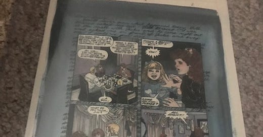
It's both! It's a copy of the original pen and ink line art, hand colored using a process called Blue Line Color, which almost no one does anymore.
This art from Hellraiser was done sometime around 1990-1991.
I don't have many copies of my ink art from this book, but here's one page which shows what the line art looked like before it was colored.
The line art would be printed onto a print-ready sized piece of watercolor paper, but the lines would be printed in non-photo blue. Non-photo blue is a particular shade of blue that can't be seen by graphic arts cameras.
The watercolor painting is done on top of this non-photo blue copy.
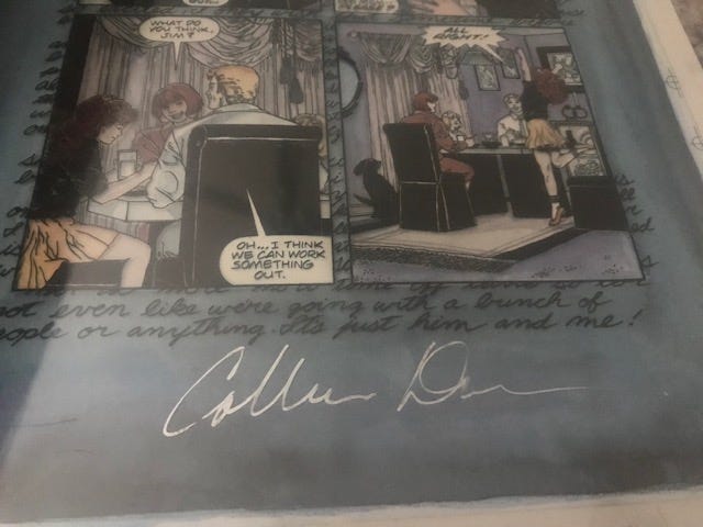
The black and white line art is printed on a separate sheet of clear acetate which is then placed on top of the hand colored copy and affixed with tape.
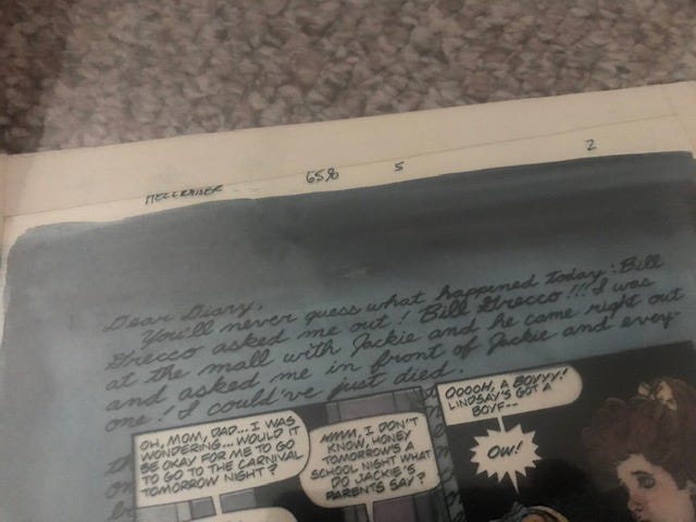
Registration marks, shown to the right of the image in this picture, allow the printer to make sure the cover copy of black line matches the underpainting in watercolor. This can be tricky, because the watercolor warps the paper a bit and the top and bottom images were often slightly off. If you look closely, you can see the effect in this photo.
At the time this art was done, there were three primary ways to color comics.
1) The original comic book coloring process which used Dr Martin's Watercolor dyes to paint the pages. The original art for these pages never actually saw print. These hand colored pieces were nothing but technical guides for the workers who then used color codes to create the final print colors. This is a really time-consuming task that no one misses. A good explanation of that process is HERE. I've always thought it ironic that, for the majority of the life of the comic book industry, a colorist's work was never actually seen.
You could actually submit your color guides with no color on them at all. As long as the codes were correct, the separations could be done.
You can see here where the codes for the colors are written directly on the art.
2) Painted comics, of the sort Alex Ross does. Shot from original paintings.
3) Blue line color, which was all the rage for a short time, and looks really nice, except for the constant issues with getting the black to line up properly. This process is pretty much obsolete because it is easier to get the same and better effects with digital.
About ten years ago, I was in the Marvel offices and an artist had just turned in some lovely pages that the editor was raving about. He was thrilled that the artist had invented this new, hand colored process! "But...that's just blue line color. We were doing that back in the Epic Comics days."
Oh, those young whipper-snappers!
Anyway, by the time I did this art, I was becoming more and more concerned with longevity, so these watercolor pages were created using high quality Winsor Newton paints, and they do not appear to have faded, these lousy photos notwithstanding.
It’s not that some watercolor pigments won’t fade, but that depends entirely on the use of particular colors, and these are easy to identify using the codes on the paint tubes as seen in this article. On the whole, they are much better quality than Copic markers or other dye based color methods.
Had they been painted using Dr Martin's Watercolors, they would have lost a considerable amount of their luster by now.
Of course, digital coloring is far more effective, but much more is expected of colorists these days. It's a challenging technical job and colorists are often expected to do production work that used to be an in-house function. As you can see from the old-fashioned Superman sample above, that page may have taken 1 hour to knock out. A solid digital color page can take far longer, especially if the client expects painted effects and color holds.
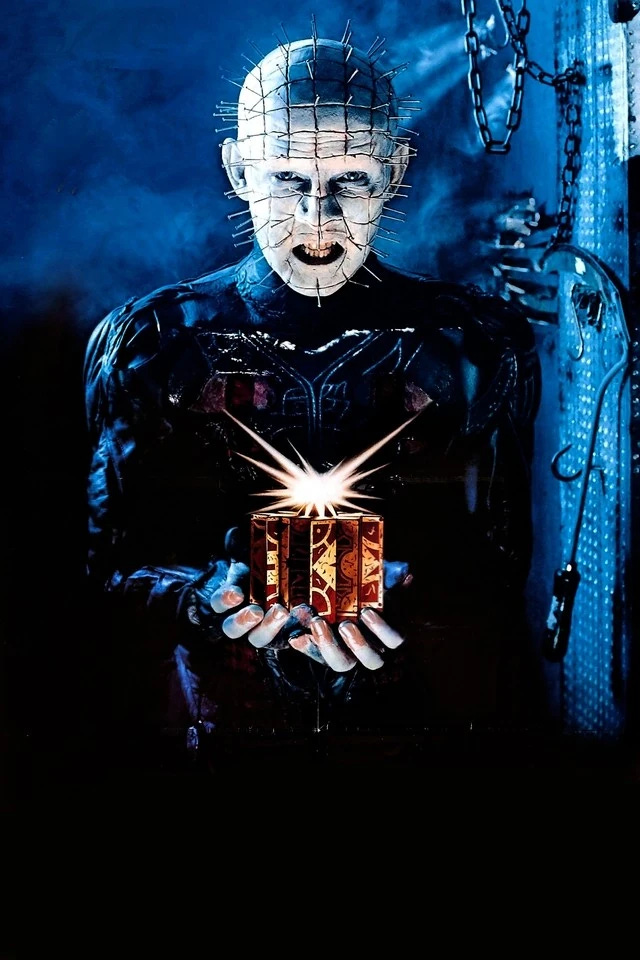
One of the funny things about this Hellraiser story is some Clive Barker fans hated it for its tone and romance comic style art. I actually had a fanzine editor get in my face about it at a show (as in genuinely hostile, I though he was going to go full Pinhead on me). He liked the art I did on later stories, but not this one.
I was instructed by the editor and in the script to draw the story this way, because it's about a young girl writing in her diary about romance, and the art was supposed to reflect her internal state as an immature child in school. When I explained to the irate fanzine editor how the art style was entirely on point, he sort of went "Oh," and walked off.




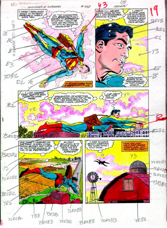
Hey, that's late-eighties Jerry Ordway on the color guide! He is among my favorite artists of superhero material, particularly from this period. His work with Mike Machlan on INFINITY, INCORPORATED featured many nods to DC's earlier artists. Here, on ADVENTURES OF SUPERMAN, some of that carries over, such as circus-strongman torso, inspired by Wayne Boring's model.
Thank you, Colleen.