
Working on the Road
Wonder Woman double page spread.

A look at some of my process on a double page spread for Gotham City Garage. From a job I did in 2018.
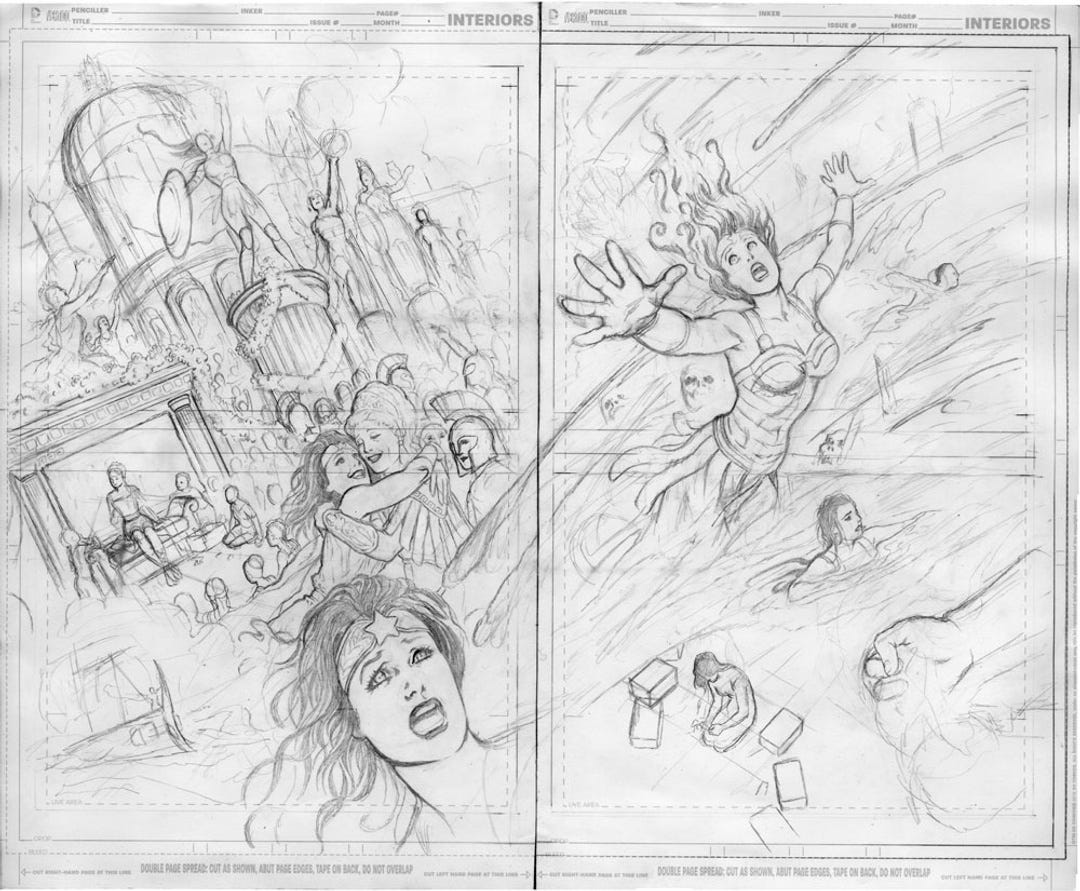
I had to do this on the road, which is tricky, because art like this isn’t easy to carry. Also, I had to do my thumbnails while on the plane and get approval before starting. This is the first time I did that, just snapping a picture of my thumbs and emailing them to my editor. I sure do love these modern times where I can do that with a phone!
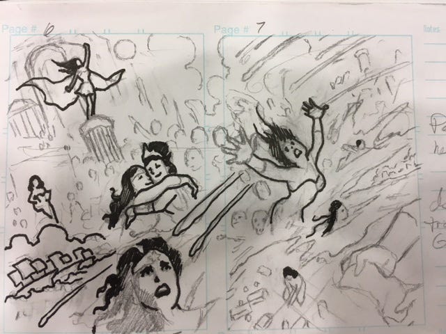
Working on the road used to mean running around a strange city trying to find a place to fax or fedex stuff. I still hear the ancient sound of the fax machine in my ears after all these years.
This is a sketch for a double page spread. Double page spreads are made by taking two standard comic art pages, trimming them at a line indicated, then taping them back together. This makes them the perfect aspect ratio for a double page spread, and you can fold the art for convenience without hurting it. However, this art got wrinkled anyway as my bag was slightly too small to carry it safely on the plane and I was afraid to pack it. I have a horror of having unpublished art stolen out of my luggage.
I took the paper back to my room and tried ironing the wrinkles out, which kinda worked. But I worried this wavy paper would be difficult to ink on.
Also, as I went along, I decided some of the figures needed to be altered, made a bit larger or smaller. Now, if I were working at home, I’d just scan my drawing, select what I wanted to enlarge in Photoshop, then print it and lightbox the changes on my drawing board. But I wasn’t at home: I had to eyeball all the changes, and it’s been so long since I did that I forgot how hard it was. It easily made drawing this page take twice as long, because every time you think...hm, “Maybe that should go just a tad to the left,” you have to erase and redraw the whole thing a tad to the left.
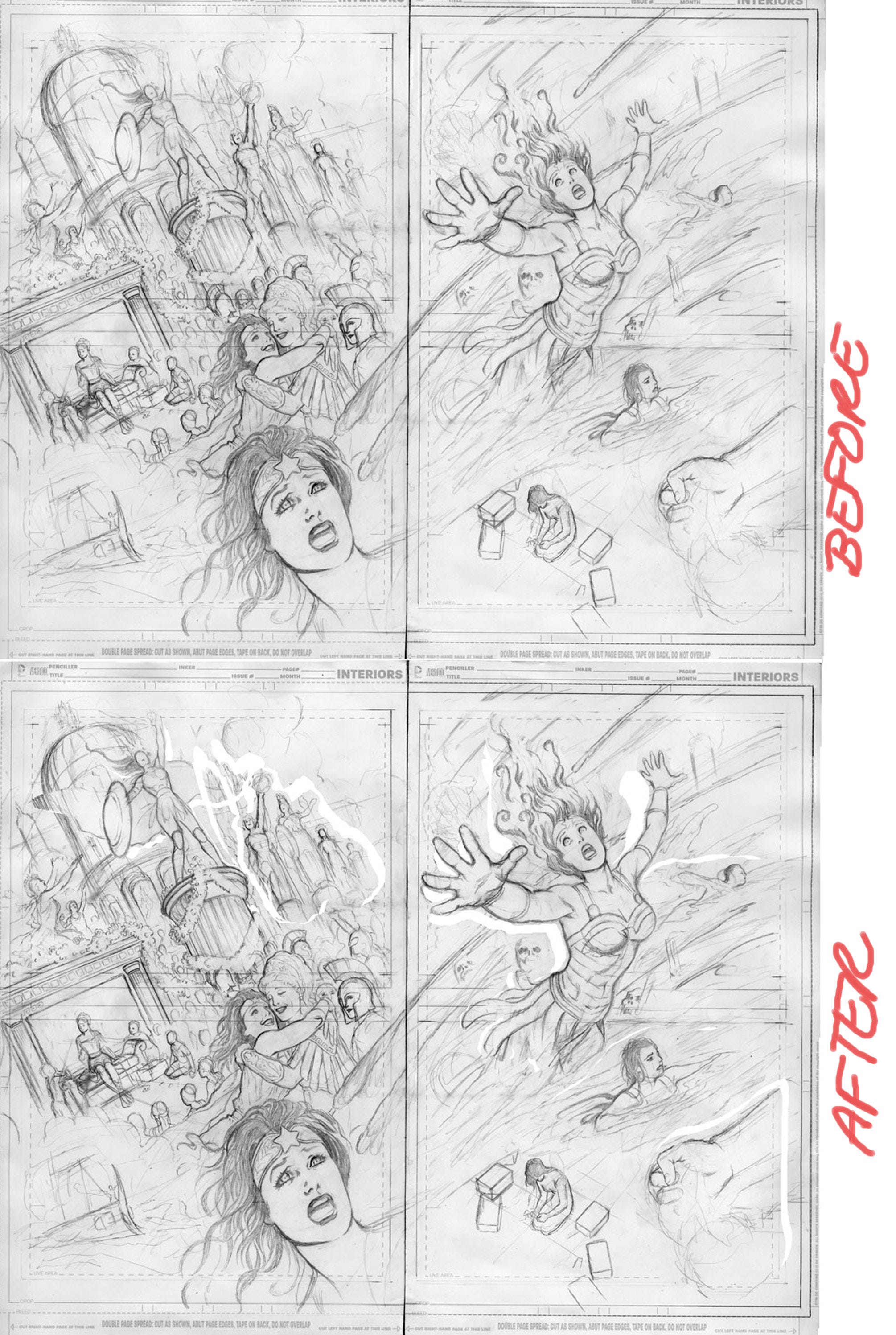
Between the wrinkled paper and my wish to make some fundamental changes, I decided to just let it sit until I got home to finish it off. This is a look at changes I made in the drawing after tweaking in Photoshop. The changes are subtle, just a bit larger, just a bit over there, but I think they made the layout better.
I took the bottom copy, put it on my lightbox, and meticulously redrew the whole page cleanly on fresh, unwrinkled paper, then inked it.
The final appeared in Gotham City Garage #8. The art is full color with color by me as well, and I took screen shots of the whole process. This is the first time I’ve ever colored interior art for DC, and I was nervous about making some stupid mistake, but the files were fine.
I never even acquired a lightbox until 1996, and always used to eyeball all of my work: no computers back then, no copying things and moving them around. I was the slowest artist ever because I would doggedly draw and redraw and redraw with no tools but a pencil and eraser. No pantograph, no photocopy machine. I’d almost forgotten how tedious that was! It forced me to learn to see, and to work things out.
But I’m just as glad I don’t always have to!
Now here’s a look at the color process.
Since the art required extensive redrawing, I decided to keep the pencils as they were and do revisions and final inks on a lightbox. The final inked drawing is here. All work is by hand.
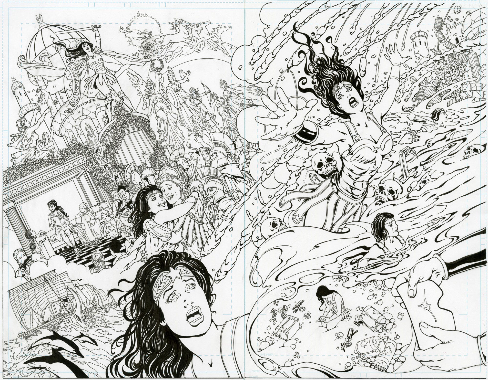
For the first time, DC asked me to do the colors as well. I have fairly limited interior color experience, and was anxious to give it a go.
Coloring today is different than it was when I started trying to learn the process. I do not use channels, which was the standard back then, and I never quite figured out how to do it. Because color work would seep under the black line art and show through in little blobs, some tweaking had to be done to get a pure black. It’s no longer necessary with modern printing techniques. Someone explained to me how this all changed just a few years back, but I forgot the details.
At the time I did this piece, I didn’t even understand about color flatting, which meant this took way longer than it should have.
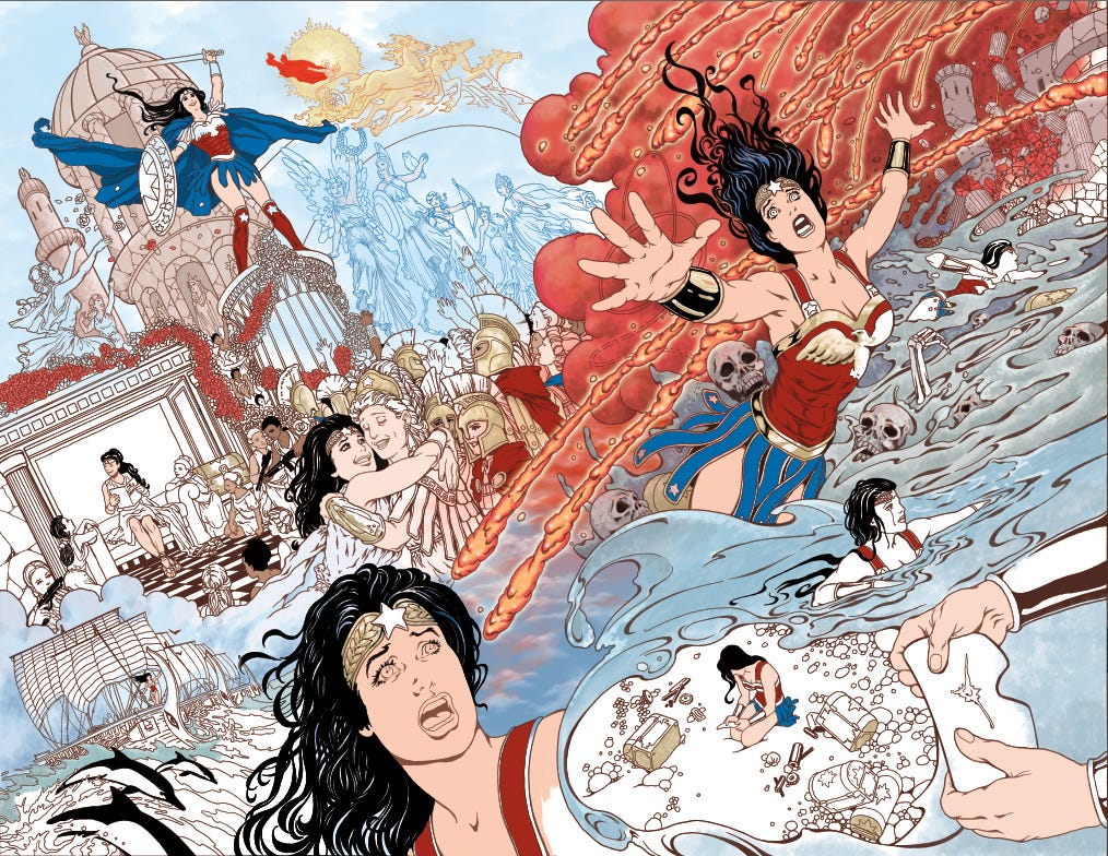
I forgot to get early screen shots of the process. Sorry. But here you can see how I selected large areas of the ink and converted them to sepia and blue, leaving black for accents.
The glow on those explosions was achieved by coloring on a separate layer and then converting the layer to glow. I learned that working on this job and felt like I’d found the Holy Grail. It’s a great effect and so easy to do!
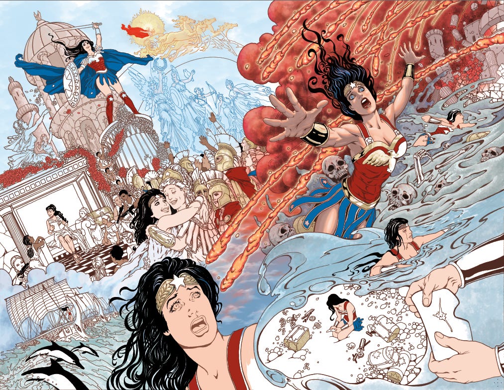
A little progress here, coloring in the flesh tones and so on. I’m not adept at making selections and doing all the things pro artists are supposed to know how to do, so it takes me longer to pull all of this off. It wasn’t easy to get online training in the past because of my rural bandwidth restrictions, but now I’m able to watch videos and learn things. I spent a lot of time on a recent work for Marvel watching training videos step by step to figure out how to do a job! It’s surprisingly easy the more you get the hang of it, but there’s a lot of incomplete or incorrect information online as well. You can really get caught in some major technical errors if you don’t know what you’re doing.
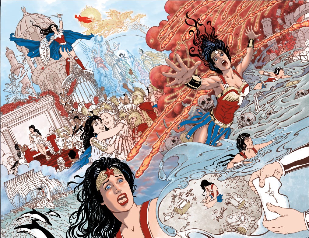
I’ve started coloring in the Greek gods in the back of the picture. I’m also coloring them on a layer set to glow. I love how it looks over those blue lines. Apollo is colored in golden lines. I’m so happy with how he turned out, I’d love to do a whole Wonder Woman GN in this style!
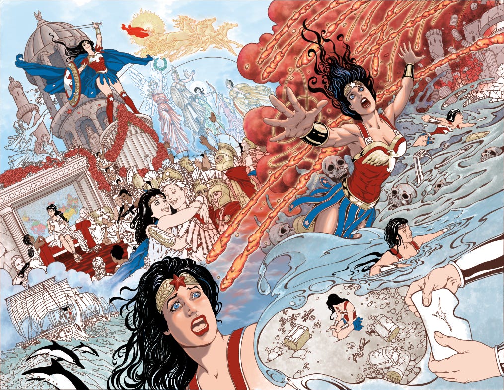
Much of this is just me hunting and pecking around with different brushes to get different effects. I wasn’t really sure how to achieve the look I wanted, but I know I did not want the explosion to overwhelm the figure work. I tweaked the colors a bit using Adjustments.
I also added a map behind Diana, which came from a clip art source. Note that the map is turned so that the Southern hemisphere is at the top. I thought maybe the Amazons had a different view of the world.
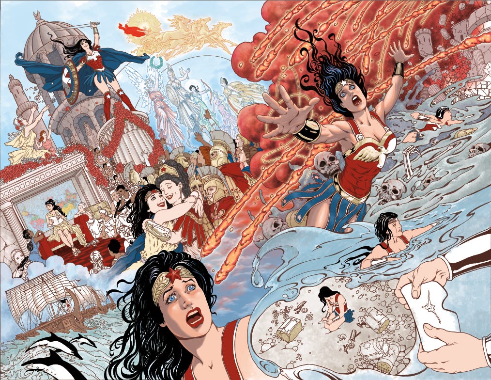
I’m working on another assignment at the same time, so I tweak this, set it aside, come back later. I’ve started coloring costumes on background figures and adding details to those roses.
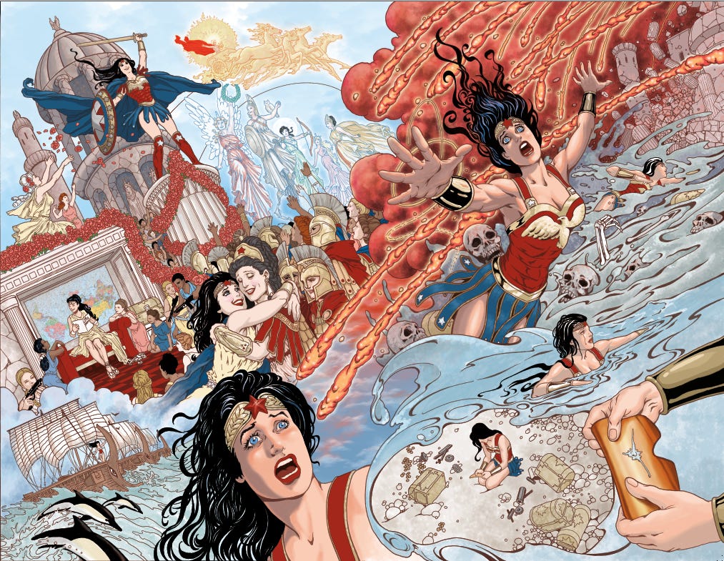
Almost done, but there are so many details on this, it’s easy to miss something. So I walk away for a few hours and come back.
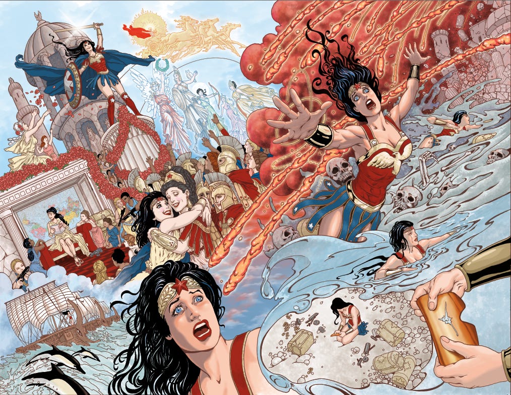
I figure I’m about done at this point, and I go ahead and get approval from my editor.
But I missed a big spot, and I was kicking myself afterward: I’d meant to put a rainbow and paint the goddess Iris around Apollo up there...and I completely forgot it. So now Apollo’s chariot rides on two blue ink lines in the sky.
The part about eyeballing figure adjustments on the road really hit home — there’s something both humbling and clarifying about being forced back to the pencil-and-eraser method. It slows you down and reminds you why the tools matter. The upside-down map for the Amazons was a perfect touch.
This is a great post. I love hearing your process (and memories of process gone by). I would never have noticed the lack of a rainbow if you hadn't mentioned it. 🌈