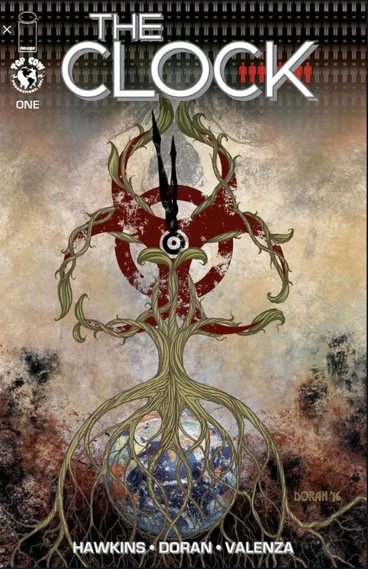
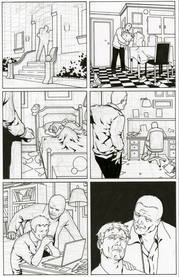
This page is from Matt Hawkins’ techno-thriller work The Clock which came out right at the beginning of COVID. You can order it HERE. Since it was a techno-thriller about a pandemic, you may imagine how that went. But I really enjoyed working with Matt on this, and Top Cow and Matt were great to work with.
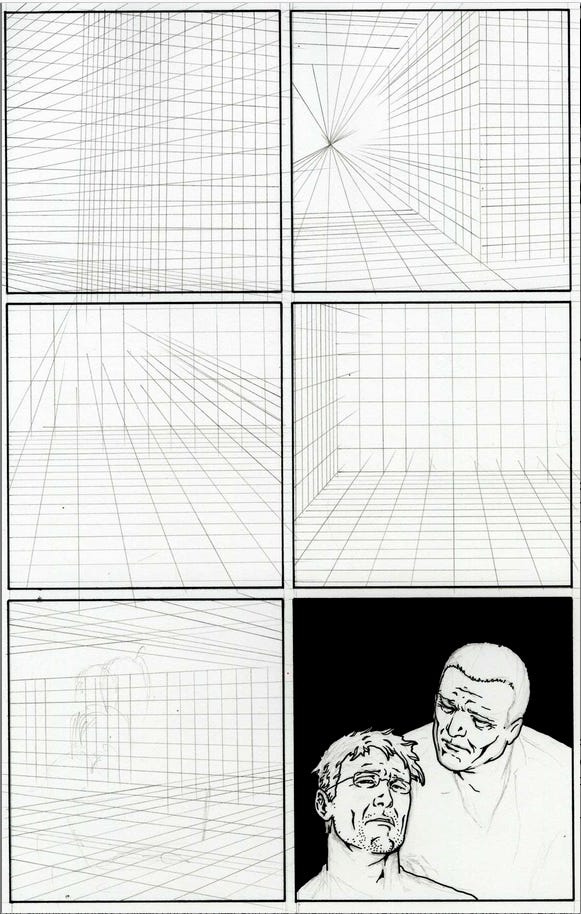
I scanned this page in stages so you could see my process from the ground up.
I like drawing character scenes like the one here, simple rooms and interactions. I don’t think they come off well in many comics, but I pour a lot of energy and effort into them. I’m lucky to work with writers like Matt who appreciate this type of work
It's important to establish solid perspective before doing any final drawing, but since the final panel doesn't require it, I just went ahead and started drawing the main characters without it.
It's not very much fun drawing these lines, but since I did this project, I often do them on computer and just lightbox them. Regardless, this is the kind of work you can do while listening to a good audiobook!
People often ask "How long does it take to do a page?" but that's not a sound metric for my production habits. One page can take 8 hours, and the next page can take 32 hours.
About 6 years ago, I abandoned any attempts to do "a page a day" and instead switched to a "hours per day" production metric. By carefully recording my work hours and what I did during that time, I realized I was not spending nearly as much time in my studio drawing as I thought I was. Hours per day went into packaging and shipping, cleaning out files, posting things like this. In one month in 2018, I spent nearly 60 hours doing a massive cleanup and inventory of my studio and storage.
No wonder art wasn't getting done!
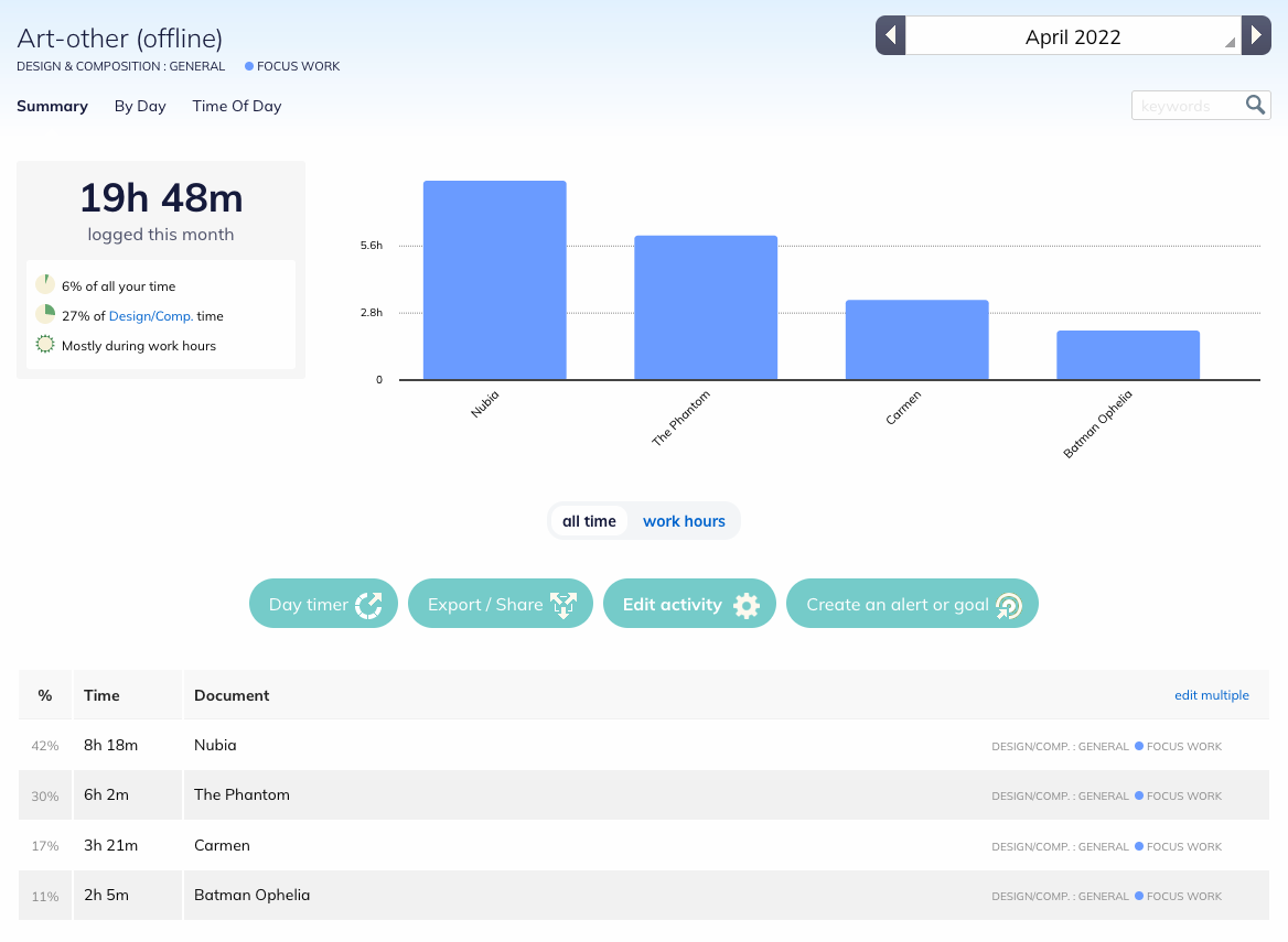
Committing to dedicated work hours instead of art volume is helping me produce more art volume than art quotas did! As I mentioned in my last post, I use Rescue Time to track the time cost of individual pages.
Here’s an April 2022 log showing the time cost of a few pages in detail.
This doesn’t show the total time cost here, just the time for work done in that month. You can also look up the time cost for an invidual job, but that is limited to a one month frame.
Everything rests on those orthogonal lines. I can see where I want to go without doing tight pencils. It’s rare for me to pencil tightly these days unless a client needs to see prelims.
I make changes as I go. For example, panel two was positioned differently. I took the original sketch, scanned it, and reduced and moved the image to the lower left of the panel. I lightboxed on top of the copy. The original composition crowded the upper right, making it look as if the main character was crouching away from the panel border.
I don’t care about realism: I don’t have any problem breaking the rules of perspective if that makes the drawing work better. But if you establish the perspective first, the figures will occupy space more convincingly than if you just try to eyeball it and hope forms kinda sorta look like they’re occupying a room. That solidity is even more important in a domestic scene.
Some people use the computer to establish perspective, but they clearly don't understand the principles and still get it wrong. Keep in mind I'm not ragging on digital art and artists. I'm stating the objective truth that just because you have a tool, that doesn't mean you know how to use it. I also use a computer for perspective now as a time saving device.
A computer program like Clip Studio Paint may make your lines all go in the right direction when you're drawing a building, but that doesn't mean you will have established a proper cone of vision before you start drawing, and your perspective may be distorted.
I reviewed a portfolio by a young woman recently who had clearly made use of digital tools to draw buildings and a car, but she had no idea how to place figures in the space. She'd actually drawn an adult foreground figure that was so badly proportioned that it would have been no higher than the waist of the adult figure behind it. The program helped her draw all those lines for the buildings, but she didn't quite understand the underlying principles of perspective affect everything...including the people in the picture, and had never learned to properly place items on the same plane going to different vanishing points.
I really don't care if a comic book drawing is wholly accurate. I like artists like George Perez who could fake perspective like a champ. But you have to know what you're doing in the first place to pull that off.
I think you can really see the George Perez influence in my work here.
The page is almost finished. This is where things get a bit bogged down as I make last minute changes. Details can also take a lot longer than you think they will! I often set the page aside to think about it for a few days and work on other pages before I turn it in. If I can, I will also sit on finished pages for days to think about them. I may have ten or more pages sitting there in this unfinished state all at once, or a half dozen finished pages waiting for tweaks.
When an editor asks me “How much do you have left?” I might say, “Oh, about 3 pages worth!” because there’s only a fraction of a percent on each of 10 pages. So then the editor will say, “Go ahead and turn in 7 pages now!” And I can’t, because I don’t have seven completed pages, I have 25% left on about 10 pages!
At this juncture, I would normally have erased most of the pencil, but I’ve left it here for you to continue to see my process. Also, if the deadline is tight, I will probably not do the solid blacks by hand, but would just drop them in in Photoshop. When I have the leisure time to get back to it, I might spot the blacks by hand after I’ve turned in the book.
A page like this is the kind of page a lot of artists dread. It is technically more difficult than doing a splashy fight page, and may even take quite a bit longer. But it is unlikely to be of premium value to art collectors. So many artists will take art shortcuts, because a hard page that is of less value than an easy page is a time and labor cost concern to process for a creator trying to make a living.
When I am not feeling very well, spotting blacks by hand is kind of zen. I can do that in an airport, or on a plane. Also, I love architecture and checkerboard floors and things. Winsor McCay was a major influence and drawing buildings and environments makes me happy.
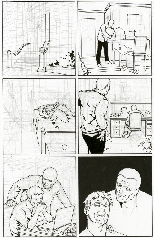
The page is still not exactly finished. But if I am not in a rush, I stop here, set it aside and look for mistakes. There are also a few things I will do digitally: add some pictures into those frames, a keyboard to that laptop.
I check to make sure things are consistent such as eyebrows (which were too thin in an earlier version of this page, as other pages show the main characters with fairly thick brows,) beard stubble (it's not on the face on the lower left panel yet,) and I like to scan the art and look at it on the computer, enlarging it and reducing it to see how the balance of the black plays out and if the line work drops out.
All of what you see here is by hand, including the blacks.
There are a lot of neat storytelling moments here that I love to drop in when I can. We see the kitchen is a bit messy, which was suggested in the script. There is only one chair at the little table. What does this mean? You will understand when you read the book!
The little girl in panel 3 has lots of sports equipment in her room, but in a previous page of the book, she is dressed in a very prim, feminine dress. This gives us a look at her range as a person without saying a word about it.
There are a pair of large sneakers, too large for the little girl, next to her bed, as well as a book on the bed. Then we see the man in the next panel, sitting at his computer. He is barefoot. We see his tension. I can imagine that he was reading a book to his little girl before he went back to work.
One thing Matt Hawkins does that I absolutely love is he drops photoreference and links into his scripts. It saves me having to do a lot of distracting web surfing. I get so lost on the web, and Matt was been super-patient with me on this job! I almost hate to turn on the computer every day, because I wander. So this effort is so much appreciated. Another writer who does this is Peter David. It's a blessing to get a script like this!
All final cleanup is done digitally. Then I place the page on a template and load it to the client's FTP.
One thing I've started doing recently is taking photos of the work on my cell phone as I go, then flipping the art, moving it around, etc.
Flipping the art helps you see drawing errors more than just about anything else. Leonardo da Vinci wrote of looking at his art in a mirror as well. There is a phenomenon called Blind Eye Syndrome that causes your brain to process things differently depending on context. So if you flip a picture, suddenly the errors in your drawings become clear. This is much easier to do on a phone than it is to constantly pick up my art, take it to the computer, and scan it.
If I find a really big error after looking on my phone, that's when I take the art to the computer and scan it. Using Photoshop, I will resize elements, move them around, print out the correction, and then lightbox it onto my final page.
Usually though, looking at the art backwards is enough for me to see the problem and I can adjust my sketch by hand. The most common problem is imbalance in facial features, but the entire body can be skewed.
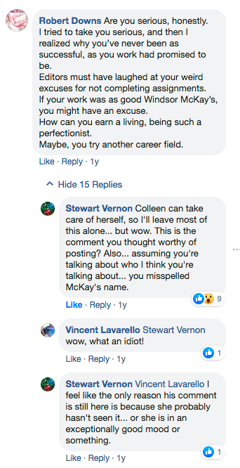
Now, let us pause for a minute and take a look at what happened when I posted a discussion about my process on Facebook.
You may find this amusing.
It gets better.
This comment came out of nowhere, so I had a look at his FB page to see what I was dealing with. His page was absolutely covered with posts about Jesus and videos of young women Christian evangelists.
I was also very surprised to see that he claimed to be a comics pro as I'd never heard of him.
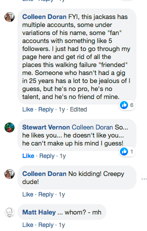
So I found his list of credits, all of them pretty minor, and none of them recent. I also found out he had at least FIVE different accounts all of which he'd used to friend me and to follow my public page. I friend anyone on my public page who asks, and don't boot anyone unless they behave badly toward me or one of the other people on the page.
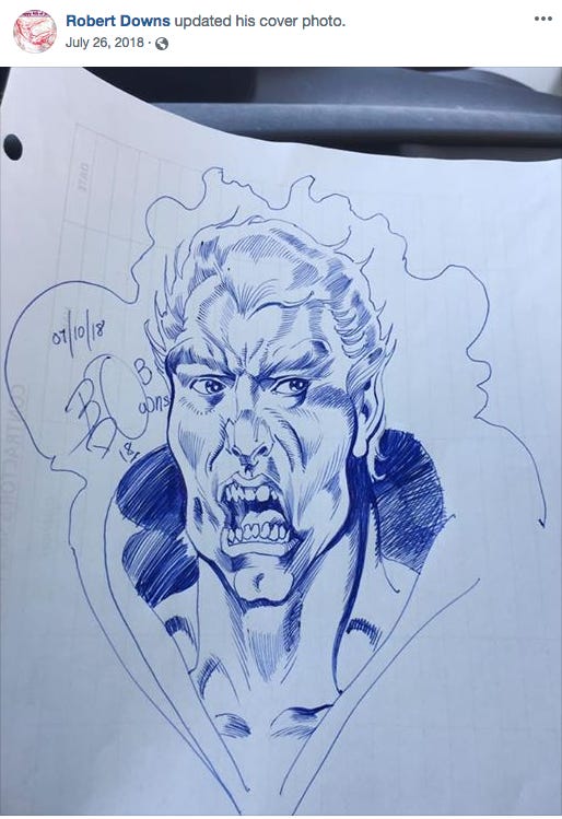
Then I got rid of him and had a look at his art. Normally, I wouldn't make cutting remarks about the work of another pro. But you dish it out, you better be able to take it.
FWIW, I used to do 60-90 pages of comic art a month, and it looked pretty bad. But never as bad as this.
I suggest Mr Downs could have used a little of my patented perfectionism.
He might actually have a career today if he did.
I don’t like to pick fights with other “pros”, but I repost this in the spirit of He Started It.
And speaking of Winsor McCay, whose name I can actually spell correctly, I worked with Alan Moore on a project entitled Big Nemo, a motion comic dystopian companion to Winsor McCay’s Little Nemo.
Not great quality video, but you get the idea.
And Mr Downs?
Eat my Eisners.




At the risk of total non-sequitur:
I'm not a visual artist, but I do printed circuit board layout for electronics. One of the most powerful techniques I've found for simplifying a layout is to mirror-image in either or both dimensions. We seem to have a "handedness" in our perception which nudges us toward certain design choices, out of many equally valid possibilities. Inverting the image reveals our unconscious aesthetic biases, and makes them eligible for intentional review. I've never heard anyone discuss this before I read Colleen's article; maybe it's common knowledge in the graphic arts.
Cool look into your process! I worked for someone who had me mixing the backgrounds digitally for layout purposes, but as you mentioned, I had no idea of where to find the horizon line, forget about how to scale people and cars and such to the backgrounds. So you sure are dead on with that one- the tools help, but without actual understanding it's using a hammer to cut down a tree.