The complete update with info about the Pledgemanager and more is HERE.
My humble nattering is below.
As you may imagine, I’m having a wonderful time working on the Good Omens graphic novel. The Dunmanifestin team asked me to pop in and give you a look at my process.
The task of adapting a beloved novel into graphic novel format is a complex, wonderful sort of pressure cooker. Even without the well-publicized complications I got smacked with over the last year, it promised to be an intense, time-consuming project.
The graphic novel is about the book and not the show. Getting Michael Sheen and David Tennant out of my head was quite a task. I’ve seen it dozens of times and I adore it, but I had to devote a lot of time to re-reading the novel and listening to the audiobook to clear my head of them.
The few times I allowed myself to watch the show again screwed me up a bit. So, I won’t watch it again until I am completely finished with every drawing. Maybe a view-a-thon will be my reward for finishing the book.
But I’m getting ahead of myself. There’s still a lot to do, so let me show you it.
Before we knew the Kickstarter fundraiser would do well, the graphic novel was to clock in at 164 pages. After the good news of the Kickstarter success, I got permission to take the story to 200 pages. That meant a major rewrite and redraw on some dozens of thumbnails and layouts.
And you guys are getting a much longer book.
Not complaining one bit. I was so happy to get more space to give breathing room to the ending.
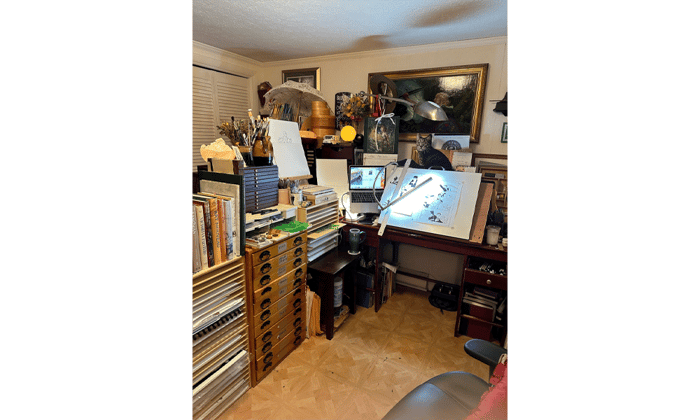
Anyway, here's a look at my workspace.
To the left is my laptop computer with the script. The laptop is connected to my graphics computer via ethernet, and all my reference is on the main system, from which I share files.
On my older projects, I dutifully printed out every bit of reference. I think this is the first project where I’ve done all reference and organizing on my MAC.
As you can see, I draw comics the old-fashioned way – by hand – and there is my script on the computer.
But I do all the coloring on this project on the MAC. I know some people hate Photoshop, but even if I wanted to switch, I don’t have the time to dive into a new system.
That entire box with all the narrow drawers in it you see there contain Good Omens pages in varying degrees of completion. Finished pages are at the bottom with layouts, pencils, and partial inks toward the top. The middle drawer contains templates, French curves, and a ruler.
The box isn’t fancy art studio equipment. It’s just a Childcraft brand puzzle storage rack. I realized a long time ago the heavy wooden bookcases, puzzle racks, and construction paper storage made for children’s classrooms made great modular storage for professional art spaces. It’s solid as a rock, heavy so little children can’t tip it, and I can move it and rearrange my space however I like.
The final art is drawn on 11”X14” Strathmore 500 acid free Bristol.
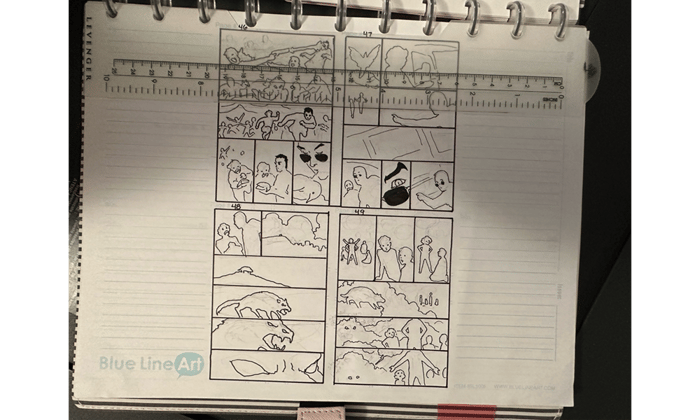
I do all my prelims as tiny “thumbnail” sketches, some in ink, some in very loose pencil. I keep them organized in this Levenger notebook. The thumbnail paper is both Canson brand, and Blue Line Pro, and both are acid free. Blue Line Pro is good for ink, but Canson is better for pencil because it has more tooth. I usually use Canson.
Using the Levenger hole puncher, I perforate my pages and keep them organized in a Levenger Circa system. It’s pricey, but I love it. There are other brands far less expensive, however.
The ruler shows how tiny the thumbnails are.
If the storytelling is clear at this small size, then it will be clear in the final.
I redo quite a bit as I go along, as you can see from the sequence below.
From thumbnail:
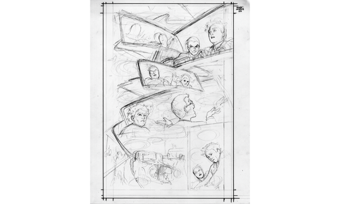
To pencils:
Since I did multiple rewrites, adding a large section at the end and popping in earlier scenes I originally had to skip, this meant redoing almost all the page numbers about 4 times.
Nearly went barmy.
I use the construction method of drawing, as you see. This is an old-school technique. Some people seem to assume that artists always use computers and tracing for their drawings, but most cartoonists of my generation work extemporaneously. There’s quite a bit of noodling around and searching in the sketches. Using too much reference often results in stiff, dead work.
In comics, it’s very important to make sure you’ve considered word balloon placement when designing a page. The script for Good Omens is more copy-heavy than most modern comic book scripts because I want to preserve as much of the clever original language as I can.
Here I scramble about working out the word balloon space allowance.
Here’s a deeper look at the process for page 2 from thumbnails to final color.
Now here is where things get a little weird. What you’re about to see is a process called flatting.
If you color a comic without first flatting the art, you are consigning yourself to many extra hours of labor and frustration.
Flatting is a way to tell the computer to select areas inside the black lines so that whenever you click on that particular color, you can paint inside that area perfectly. Since the computer only understands 1 and 2 - or on and off - when you tell that computer to stick to that area, that is what it will do.
There are computer programs that you can use to create your flats. I use Multi-Fill. The results are uniquely ugly, but they get the job done. Here is what that looks like.
Absolutely hideous.
But pretty much all I have to do from this point on is click each block of color and change it to whatever I like. The result is this:
I also experimented with selecting areas of the line work as color holds, but I’m getting into more complicated color technique than we may have time for at this point. But from here, I can start painting.
And the painting stage looks like this.
Since I wasn’t entirely sure exactly how I wanted to approach this color style, I took screen shots of some of the changes I made as I went along. In the shot at the left, I’ve given Aziraphale’s heavenly self a golden glow by using a color hold on the line. But I found it needed more contrast to make his figure pop, so I darkened it in the next shot.
I use the computer to create the initial flats, but I either do the final flats myself, or I have help from Julmae Kristoff and/or Dee Cunniffe.
The flats are (usually) not intended to be part of the final work. They are a technical tool.
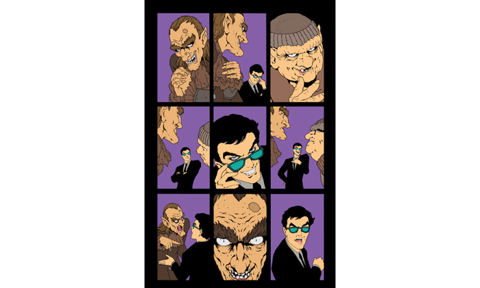
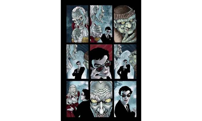
For example, here are the original, computer-generated flats for one scene in Good Omens.
And here are the secondary flats by Julmae Kristoff.
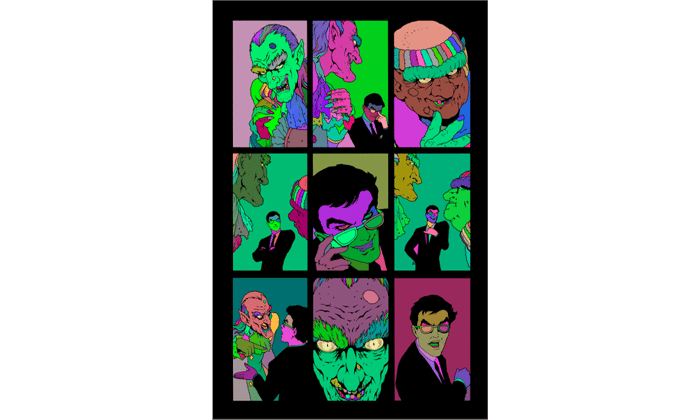
And here is my final color work.
Since I’m running behind on the book, I’ve brought in Dee Cunniffe to do some extra color work. He is a wonderful colorist, as well as an excellent flatter. I’m not sure to what extent I’ll be handing pages to Dee at this point, because I’m very controlling, and I want to make absolutely certain there are no stylistic anomalies in the art, and I want all the Crowley and Aziraphale pages for myself, is that too much to ask?
I use Faber Castell Pitt Artist pens for my inking. I sometimes use an old-fashioned crowquill as well, but Faber Castells are easier to control, and the ink uses real pigment instead of dye like many markers. All of my originals are created with longevity in mind: acid-free and lightfast. I want the drawings to be fade-proof.
And that is a quick tour of the work so far.
A thousand thanks to Neil Gaiman and the Dunmanifestin team for their incredible kindness and patience, and that goes double for all Good Omens supporters out there. Your indulgence is appreciated more than I can adequately express. I am truly sorry to have been the cause of the delay in the book, but I can only make it up to you by doing my very best.
And that is what I am doing.
BTW, many years ago, I found a little yellow duckling who was getting beaten up by the other ducks, so I saved him and took him to my home to live until my parents adopted him, since they had a nice yard and a pond, and I didn’t.
He had a birth defect and could not fly, which is probably why the other ducks were pecking at him.
He got to stay in the family house, and eat goldfish crackers, and swim in the tub. Eventually they built him his own house. We called it the Duck Majal.
He lived for ten years.
I named him Fred because I’d been watching Breakfast at Tiffany’s when I heard him quacking for help that day we met, and Holly Golightly’s brother was named Fred.
So, here’s to you Fred.








I love how you describe your process, and so looking forward to receiving the book (paid my postage and extras yesterday)