


Comic Art Negatives
We don't even use these anymore, but whatever.

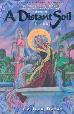
A DISTANT SOIL, my space opera graphic novel saga, got put on forced hiatus when we found out our printer dumped our negatives. We weren’t alone in this; many major publishers who worked with this client had the same problem.
If you don’t have an archive of your work, you can’t print it. We requested the negatives be returned so we could digitally archive them, as most printers were dumping the old web press system. And now they’re gone.
Anyway, when I write about negatives, most people assume I am talking about those little strips of film their mom has in the attic. Not so.
The negatives are actually quite large. My printer had some of our negatives in storage, and eventually those returned to us. Here they are with a 48″ T-square.
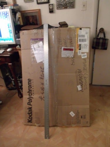
They are also quite heavy. This box, even though it is less than 2″ thick, weighs about 40 lbs.
Here they are with a page of 11″x17″ comic art placed for comparison.
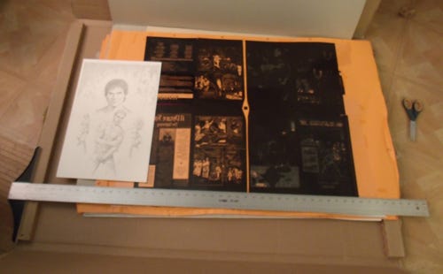
Each negative is larger than the print size of a page of comic art, placed 4×4 on large flats for gang printing.
My restoration guy Alan Harvey decided not to use any remaining archives we were able to get returned to us, as the digital restoration is superior to any restoration we could get from negatives. There would be a marked difference in appearance between art restored from the negative and art restored using Allan’s process, which is standardized, but varies page by page as the occasion calls for it. Every page has unique issues and needs unique care. And that is why I hired a specialist like Allan.
While we’ve gotten nothing but compliments on the restoration, we did get some odd comments recently about how it did not look like the “originals”.
Um, yes. It does.
One person or two assumed that the first print graphic novel is closer to the look of the original art because it was shot from negatives. Absolutely not true. I’ll let Allan explain.
Now, this probably isn’t clear to everyone, but a negative isn’t an exact copy of real life. Just as a scanner uses discreet pixels to capture an image and so loses areas between the pixels, it was a similar issue with negative. A film emulsion wasn’t light sensitive across its whole area: the emulsion was just a medium in which silver halide crystals were suspended, and it was only those that were sensitive to light. So, by definition, any light that fell between the crystals wasn’t captured. This is where image degradation comes from. And while negative was better at capturing details (only really because the crystals were randomly distributed rather than uniform like scanner pixels), the issue of replication isn’t unique to digital. Trust me, I used to spend hours, days, trying to capture lost detail in photographic processes. Capturing light images isn’t, and never was, perfect.
I learned to scan and restore these negatives myself, and I was stunned by how much darker and how much thicker they made the lines of my original art. If your archive altered the work, any restoration results you get from that source material will be altered as well. Allan came up with a plan to restore the art from the original, hand-drawn pages AND from printed copies of the book, which made for a much cleaner and clearer edition. An edition which would have been technically impossible 20 years ago.
In fact, the cleanest printed edition of the art (until now) was not the 1997 Image graphic novel: it was the 1991 self published comic edition which was shot from a completely different set of negatives. Allan had access to these comics as well, and for each page, used the best available source material, as well as photostats of art I had from a 1987 color edition of the book. These super-clean photostats were then restored by Allan to appear even better than they did in our first editions. They were especially helpful for highly detailed background work.
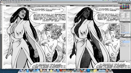
BEFORE.
AFTER.
Allan doesn’t simply set dials and scan each page, and then plop it into print. Allan carefully picks and chooses from original art and other source materials, and then reconstructs. Most of the heavy lifting on that reconstruction is complete.
The first printing of the first issue of A Distant Soil has line work and tones with a light and airy appearance because that is how the original art looks. The 1997 edition of the graphic novel looks heavier and darker because that is how the printer shot the negatives.
Also, what most people don’t know (and what some people have a real hard time understanding,) is the original art is drawn at MANY different sizes and aspect ratios. I started off doing the art at magazine proportions, and then eventually went down to a very small original art size, barely larger than manga size. In volume one alone, there are probably 7 different sizes for the original art.
This made standardizing the look of the tones and the size of the lettering tricky. I did not know how the tones would print – tones aren’t grey, they give the appearance of grey by placing little dots evenly on a piece of plastic that you adhere to your paper. When the art is reduced for print, the illusion is of a clean grey area.
However, if you use one size tone on a large piece of art, and the same size tone on another piece of art, you will get very different results. Your tone will appear darker when printed from a larger original. Your line work may disappear altogether. Part of Allan’s job was to fix my mistakes when I’d used a tone that completely obscured the line art.
On the left, Allan’s fix. On the right, the original.
Just because the tone on the right was my “original” choice, that doesn’t mean it wasn’t a mistake. If I misspell a word, I fix it. If I use the wrong tone, that gets fixed, too. Changes were made from the originals when my original choices were wrong.
I also went into the art and, pixel by pixel, added dots where tone shrank and pulled away from the edges of the image area. This is only a problem on about 60 pages. If we’d stuck entirely to the look of the “original” art, a variety of artifacts and errors would have been left in. The issue for me is the best, most consistent look in the final print edition. It’s also a major reason why the first 13 issues were re-lettered from scratch by Allan using the font created for me from my hand lettering style by Comicraft. There was more than one letterer on the book, and my early lettering is especially bad. Replacing the other letterer and my early amateurish lettering smooths the transition into my later work, which improves over the course of the series. And if you look very closely, you can also see how I went into over half the pages and changed the placement and spacing of the words, and removed some of my eccentric punctuation.
I did not get proper instruction about scanning original art or negatives until years after from Jose Villarubia. For example, the art on my graphic novel with Barry Lyga, MANGAMAN looks darker and heavier than I drew it, because I did not scan the pages as greyscale and convert to bitmap. I scanned the pages as bitmap, which you are not supposed to do.
Since I worked on the book in 2010, I’ve learned a lot!
Another look at just how off negatives can be: the cover of was shot from a negative. I personally made arrangements with the photographer to shoot my art. Here is how the book looked in print.
And here is the exact same cover art again shot from another negative, scanned and color matched to the original art by me.
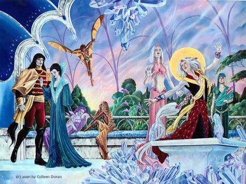
Like night and day, folks.
Anyway, I hope this answers a few questions out there. Negatives aren’t a true picture of your work. They’re just negatives. While you may struggle with the dreaded moire patterns when scanning tones from original art, these issues pale in comparison to all the improvements we’ve realized in all other aspects of production on the new editions. And since the tone sheets I use are intended for Japanese sized art, and my originals are of comparable size, we don’t encounter moire patterns on later pages. Volume I was virtually moire free, and I didn’t see any flaws in the tones in Volume II at all.
In retrospect, I don’t think our printer actually shot negatives of most of the work in the first place. I will blog more about it later, but there are anomalies in the final printed work that I now know are dead giveaways for art printed from poor quality digital scans.
Negatives aren’t the be-all and end-all. Negatives can be just as far off the mark as a digital scan. It takes someone who knows and cares about what they are doing to coax a book to finish, and to get it to look as good as possible. In the end, losing the negatives, while expensive, time-consuming, and very frustrating, has been the best thing that could have happened to this book.
Originally published in 2016 on my blog and in 2018 on my Patreon.
Your support here at Substack is much appreciated, but if you’d like more frequent updates, interaction and sneaky peeks, my PATREON IS HERE.
This was fascinating! I love hearing the Inside Baseball stuff, and have a copy of the 'How Comics Are Made' book on order. This, together with your post regarding colour fastness of markers, is also sobering. A reminder of how all things decay, and what an effort it takes to fight that process.
Printing and scanning has come a long way in the last forty years